Case study
Vamo
Designing a fintech brand and product experience that makes personal finance feel empowering, not overwhelming.

Overview
Vamo is a fintech platform that helps individuals save smarter, invest with confidence, and stay on top of their financial goals. The team came to us with a clear vision and needed a visual identity and product experience to match it.
The challenge was to make something that felt genuinely trustworthy — not sterile or corporate, but energetic and warm. Fintech often defaults to either cold blues and charts, or over-friendly illustrations that undercut credibility. Vamo needed to occupy a third space: competent, clear, and distinctly human.
We worked across three interconnected streams: the brand identity (logo, colors, and tone), the product design (app flows, UI components, and interaction patterns), and a design system that ties both together so future screens and campaigns feel like they come from the same place.
The result is a cohesive system built around Vamo's core color — a distinctive electric lime green — that reads as progressive, modern, and unmistakably theirs.
Challenge
Personal finance tools have a trust problem. Most people feel either intimidated by them or annoyed by oversimplified nudges. Vamo needed to earn trust without losing personality.
The audience spans first-time savers in their twenties to seasoned investors who expect more control. Designing for both means the interface has to feel accessible at a glance but reveal depth as people engage. Dashboard summaries need to feel instantly readable; settings and goal configurations need enough structure that experienced users feel respected.
The visual identity also had to work across digital touchpoints that evolve quickly. A logo in an app icon is different from a logo on a pitch deck. Typography that looks sharp on a 390pt screen needs to also carry authority in a press kit. We needed a system, not just an aesthetic.
Finally, the team was building fast. Handoff needed to give engineers confidence: clear tokens, precise component specs, and a documented rationale behind every decision so the system could be adopted without a lengthy onboarding call.
Strategy
Three principles shaped every decision: clarity over decoration, energy without anxiety, and a system first mindset.
Clarity over decoration. Every element in the UI earns its place by making something easier to understand. Balance summaries use weight and hierarchy, not just color, to guide the eye. Charts are readable at a glance. Action buttons are unambiguous. We removed anything decorative that didn't carry meaning.
Energy without anxiety. The lime green primary is vibrant and distinctive, but we paired it with a deep navy that grounds the palette and keeps heavy data from feeling frantic. The green appears on wins: positive balance changes, completed goals, confirmations. The navy provides structure. Together they communicate forward motion without raising the heart rate.
System first. We designed tokens before screens. Color, spacing, and type scale were defined in Figma variables before a single component was drawn, which meant every screen inherited the same foundation. The design system is the product, not documentation written after the fact.
Brand Identity
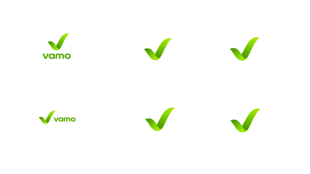
The Vamo identity centers on a single, confident mark: a bold checkmark inside a circle. It signals completion, progress, and reliability — the three things every Vamo user wants to feel.
The wordmark pairs with the mark as a lockup. The lowercase treatment keeps the brand approachable. The heavy weight gives it authority. Together they work at every size, from app icon (16×16) to billboard, without relying on color to hold legibility.
Visual Direction
The mood board explores the tension between precision and vitality — technical accuracy meets organic growth, dark depth meets electric lime energy.

smarter.

The mark as currency
Minted on a gold coin, the checkmark reads as value kept, not value spent. We use it in campaign art to show what Vamo is about: the money stays with the person who earned it.
Design System
Every token, component, and pattern was designed to be used, not admired. The system ships as a Figma library with variables mapped directly to developer tokens.
We organized the system into four layers: Foundations (color, typography, spacing, radius, shadows), Components (buttons, inputs, cards, navigation, charts), Patterns (goal cards, transaction lists, onboarding flows, empty states), and Templates (home, portfolio, transactions, settings). Each layer builds on the one below it. Engineers and designers work from the same named values.
Product & Website
The landing page and app screens were designed in tandem, sharing the same token foundation so the marketing site and product feel like one continuous experience.
The landing page leads with the value proposition above the fold, supported by social proof and feature highlights. Every section moves toward a single CTA: get started. The app screens follow a similar logic — home is a summary, each drill-down reveals depth. Nothing competes for the user's attention.
Add up to 4 cards for family members.
Move money between cards instantly. Use anywhere in the world or online.

Send money home instantly for $1.99.
No hidden fees. Just $1.99 per transfer, even internationally.

No fees. No waiting.
Your employer direct deposits your wages into your VAMO bank account. No paper checks. No check cashing lines.

Online & In-App Purchases
Pay anywhere online or in apps like Amazon, Uber and DoorDash with your VAMO card.

Pay your bills online. Instantly.
Pay bills from your VAMO account, in the app or online. No more money orders.

Get paid for other jobs.
Deposit checks directly into your Vamo account using your mobile device.

You are protected
Your Vamo card is protected against unauthorized purchases, fraud and accidental loss. Every time. Everywhere.

Outcomes
The Vamo team shipped their redesigned product and landing page within eight weeks of design completion. The design system continues to serve as the single source of truth for all product decisions.
The brand has since appeared across the app, marketing site, App Store listing, investor deck, and social channels — all from the same Figma token library. New screens and features are being added by the in-house engineering team without requiring design review on every component, which was the goal from day one.
8 wk
Design to launch, brand & product
120+
Design tokens in the system
3×
Faster onboarding for new engineers