Case study
Areté Intelligence
Logo, brand identity, website and sales tools for Areté Intelligence, the AI division of turnaround firm Areté Capital Partners.
Overview
AI transformation meets turnaround expertise. Areté Intelligence designs, builds and deploys AI infrastructure for middle-market companies and their sponsors, from first diagnostic to full-scale transformation.
It is a dedicated AI division inside Areté Capital Partners, a middle-market turnaround firm. Areté Intelligence inherits decades of operator-led execution and adds AI engineering on top: it deploys working technology from day one, not strategy decks or proofs of concept.
We created the brand from the ground up: the logo, the identity system, the website, and the sales tools the team uses with clients, including the pitch deck and one-pagers.
Challenge
Turnaround is about stability. AI is about change. The brand had to hold both.
Areté Intelligence speaks to PE sponsors, portfolio-company leaders and mid-market enterprises, people who carry the responsibility when a business is under pressure. They need confidence and control, not hype.
The identity had to feel as dependable as a seasoned turnaround partner, show that this is a new, AI-native offer, and sit naturally beside its parent, Areté Capital Partners. The name itself set the bar: areté means “the aggregate of qualities, as valor and virtue, making up good character”.
Logo
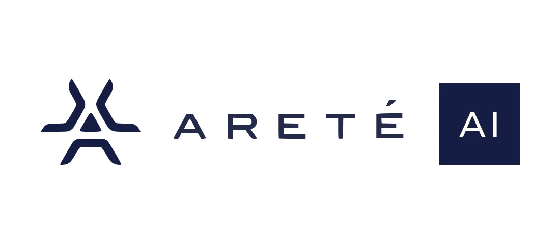
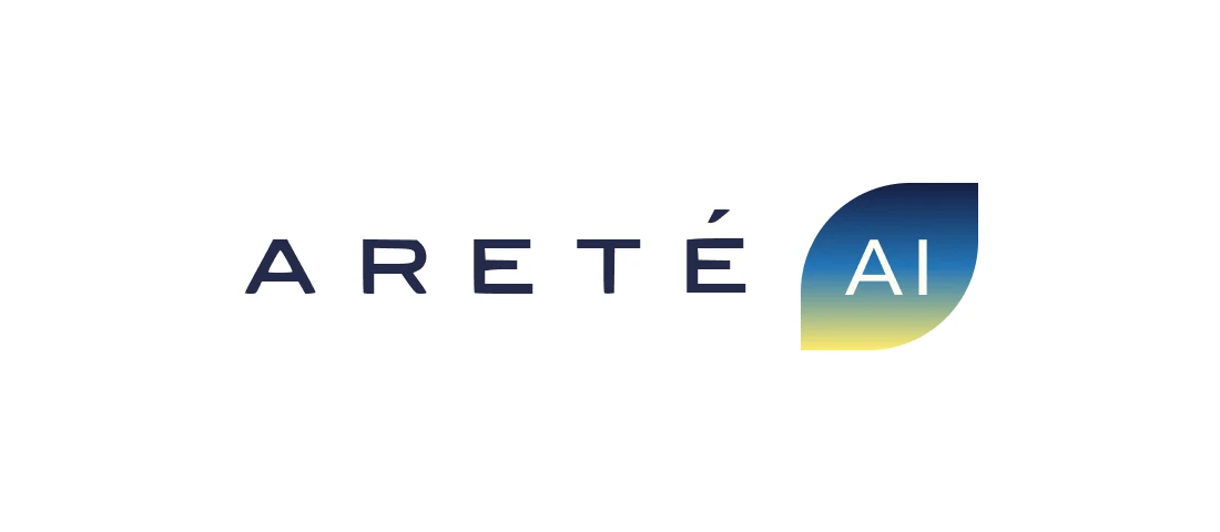
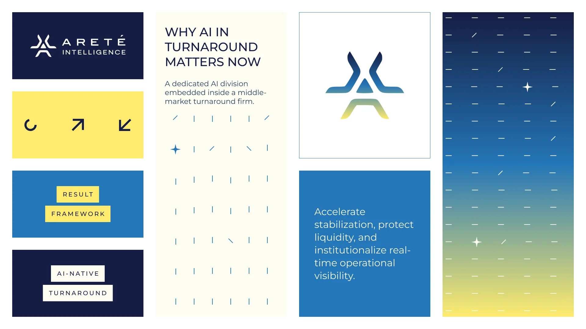
A symbol of converging paths, and a widely spaced wordmark that keeps the accent on the É.
The mark brings separate strokes together into one form: an “A” that also reads as paths meeting at a single point, the way Areté brings operators and AI together. The wordmark is set in open, evenly spaced capitals, calm and confident.
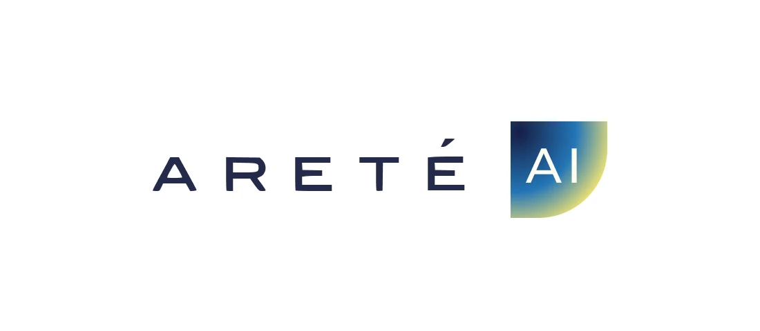
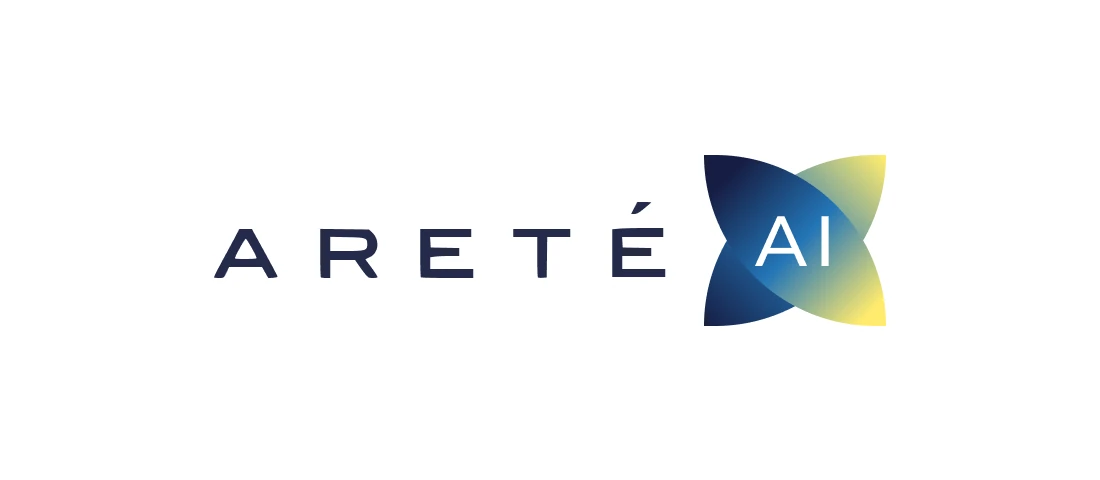
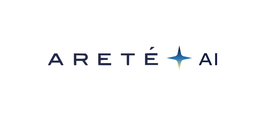
We explored six ways to mark the AI division within the Areté family: a solid “AI” block, gradient tiles in leaf, quarter-round and petal shapes, and lighter options where “AI” follows the wordmark with a spark or a four-point star. The final lockup works in midnight on ivory, ivory on midnight, and as a standalone symbol.

Identity
Midnight and ivory for trust, a bluebird-to-beam gradient for intelligence.
Five named colours carry the system. Midnight and Slate give it weight; Ivory keeps it warm and readable; Bluebird and Beam meet in a gradient that marks anything AI-driven.
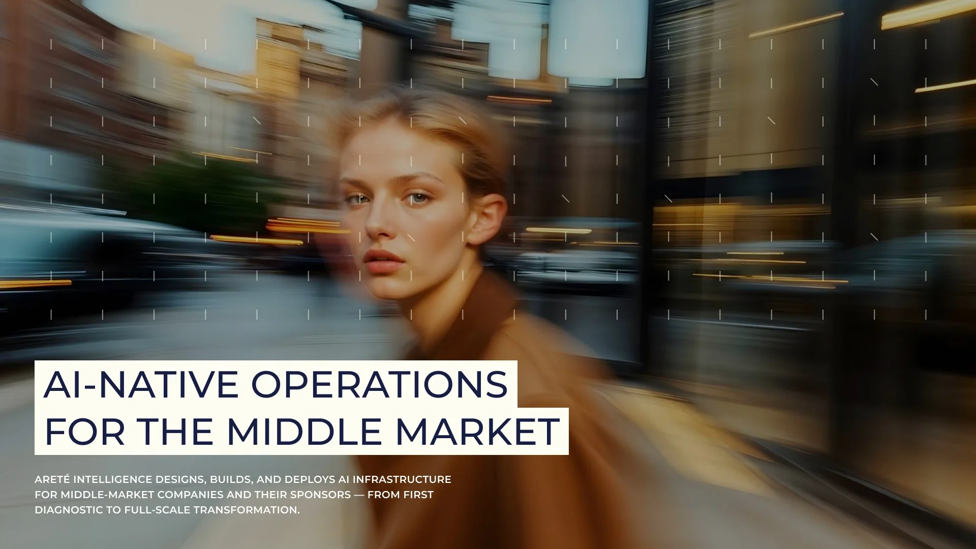
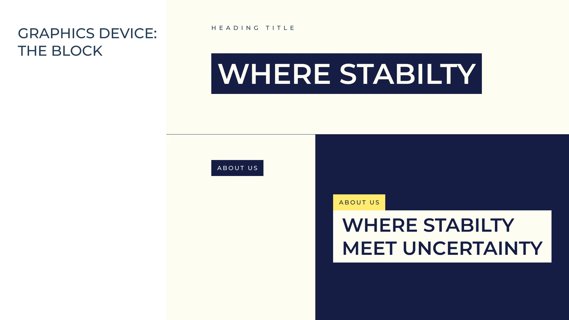
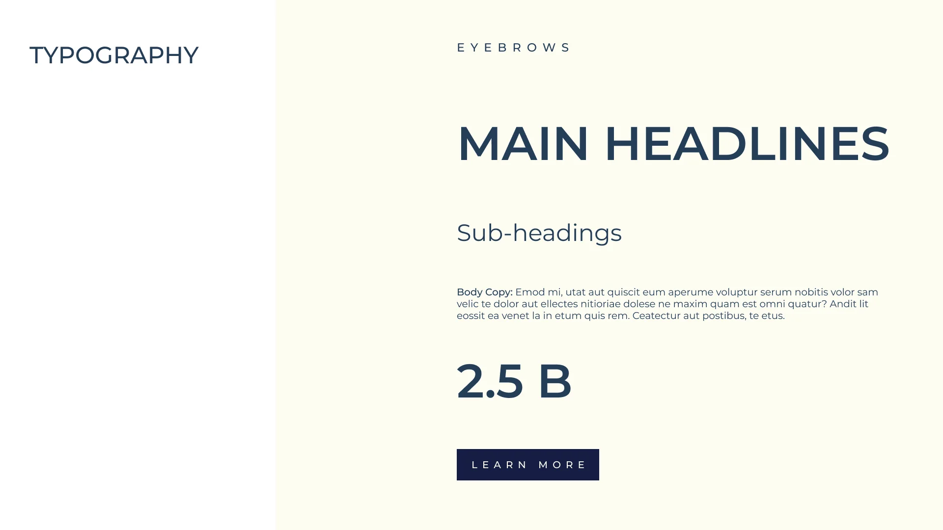
The signature graphic device is the Block: headlines set in midnight on ivory bars, like labels on a confidential document. It turns every headline into a statement, from “Where stability meets uncertainty” on the website to the pitch deck. A grid of fine marks and plus signs adds a quiet sense of data and measurement.
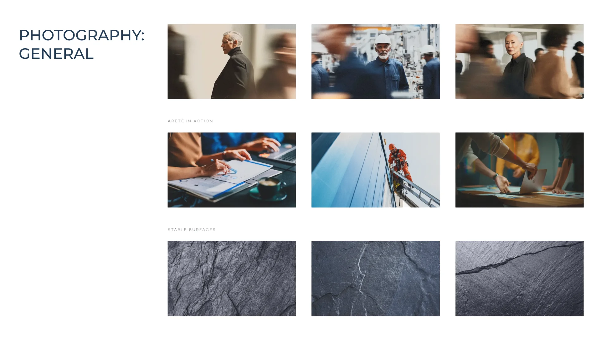
Photography follows one rule: one person sharp and looking at the camera while the world moves around them. Headshots are calm and natural, on ivory.
Website
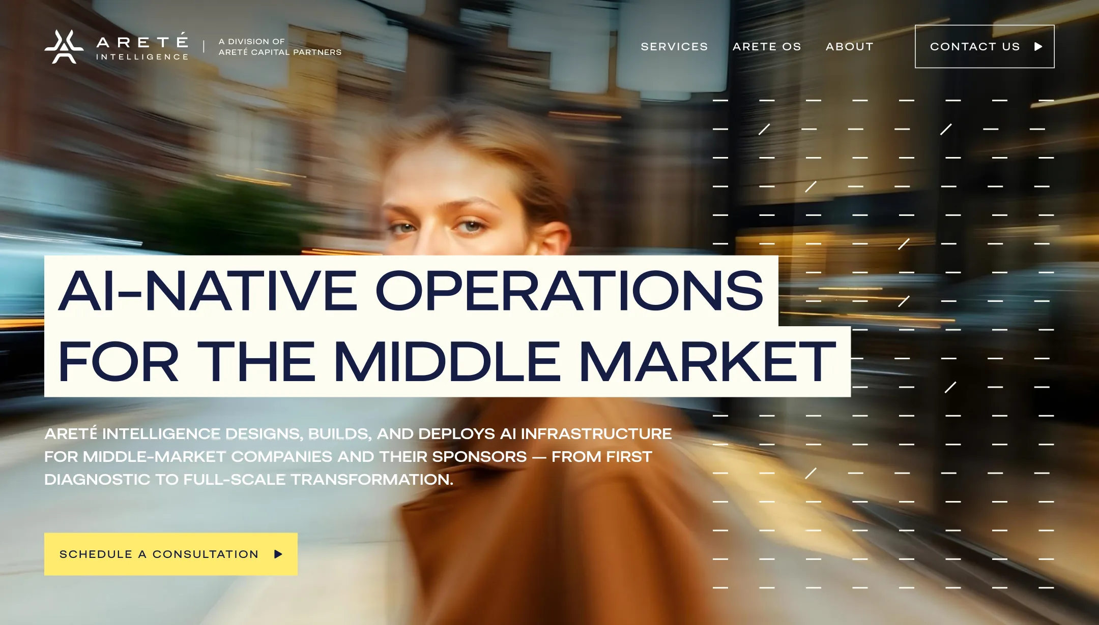
“AI-native operations for the middle market”, set on ivory blocks over a city in motion.
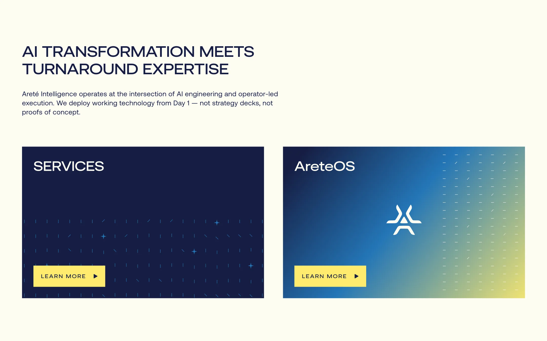
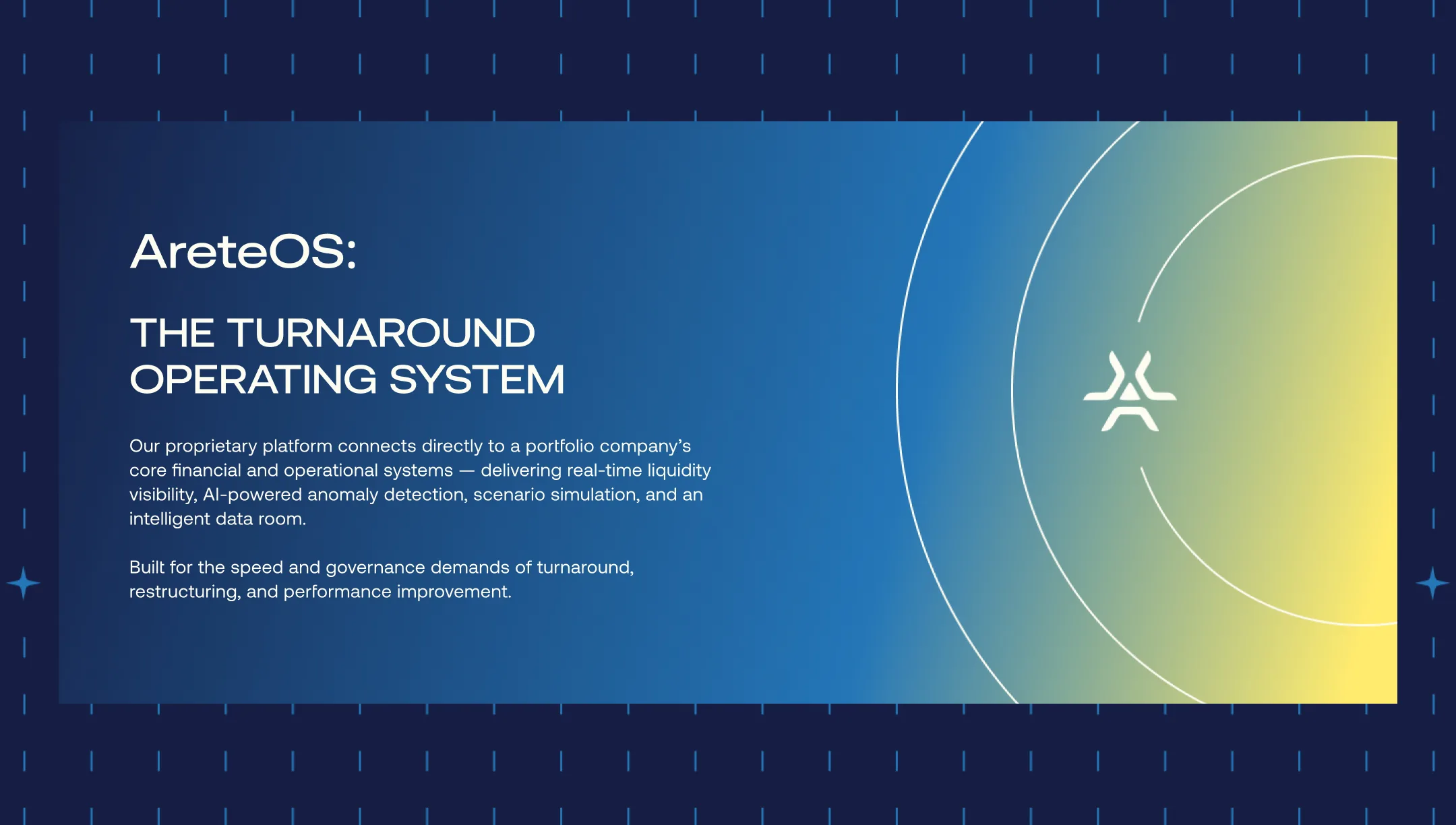
The homepage leads with the promise and a single action: schedule a consultation. Below, two large cards split the offer into Services and AreteOS, the turnaround operating system that connects to a portfolio company’s financial and operational systems for real-time liquidity visibility, AI-powered anomaly detection, scenario simulation and an intelligent data room.
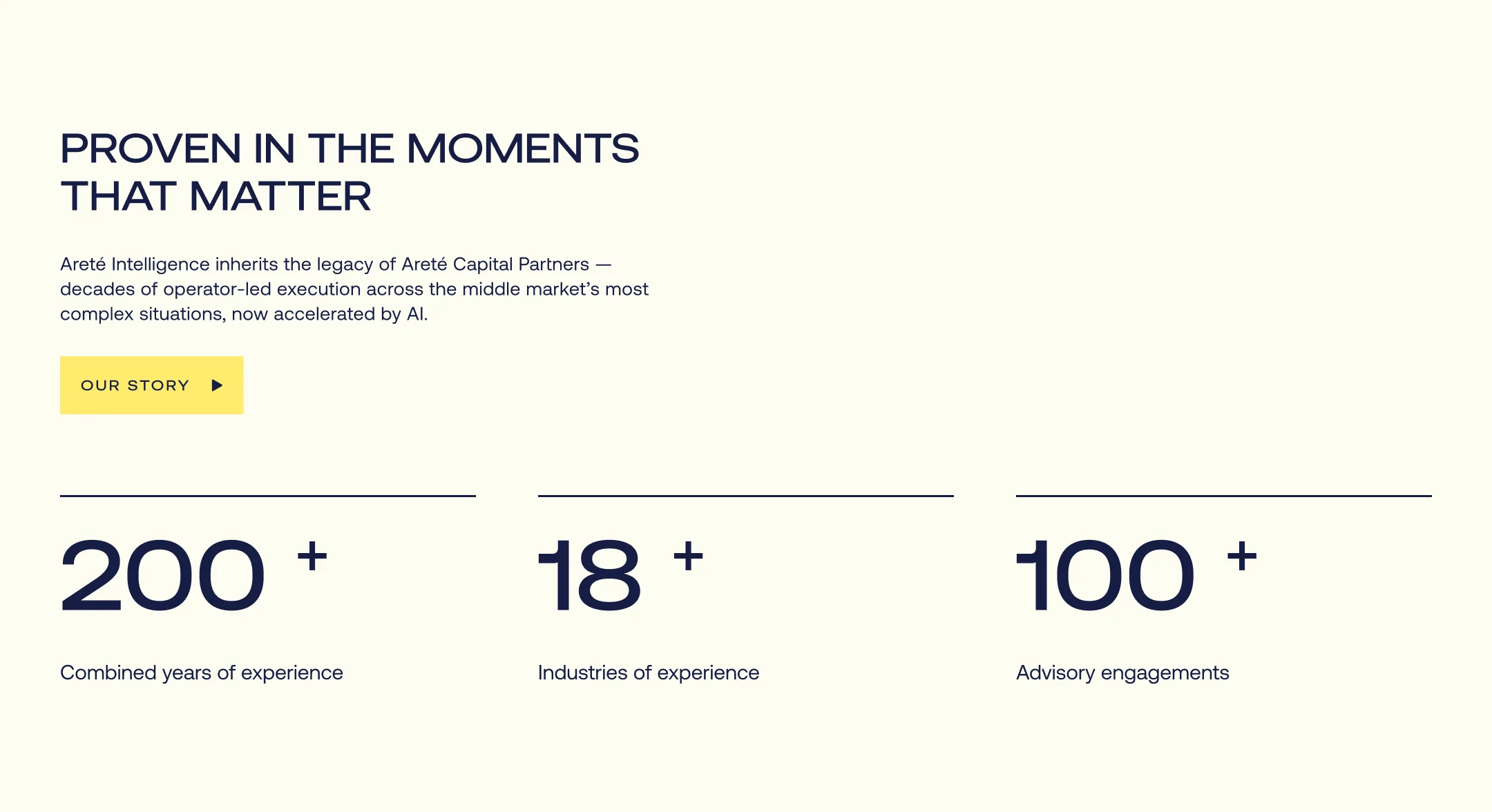
Three engagement tiers make the path clear: an AI Diagnostic & Assessment in 2–4 weeks, Embedded AI Transformation over 3–6 months, and a Full-Stack AI Capability Build over 6–12 months. The site closes with the firm’s track record and the three audiences it serves: PE sponsors, portfolio-company leadership and mid-market enterprises.

Sales tools
A pitch deck and one-pagers that carry the brand into the room.
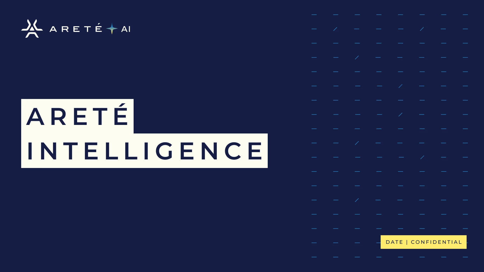
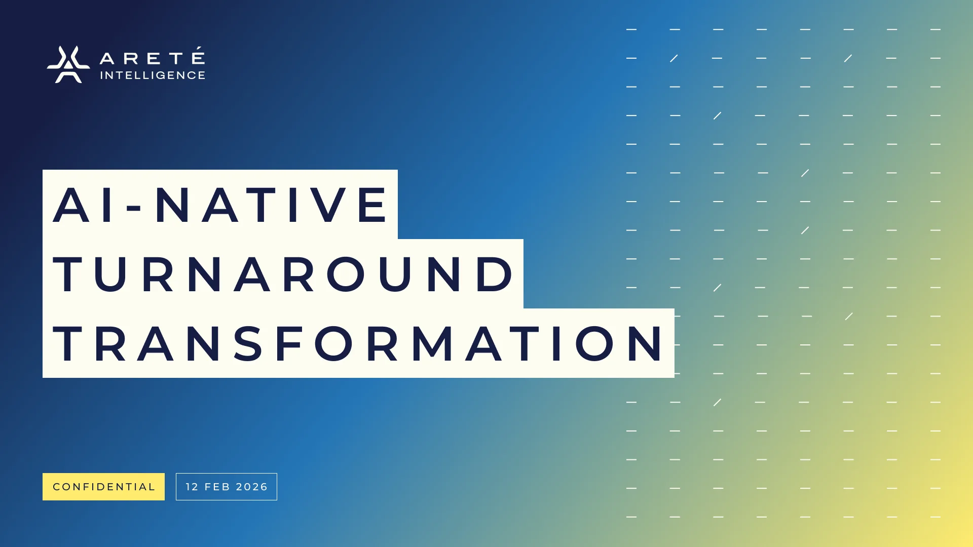
The client-facing deck takes buyers from why AI in turnaround matters now, through Areté’s position and engagement tiers, to AreteOS and the first 30, 60 and 90 days. Cover slides use the same Block headlines, mark grid and gradient as the website.
Strategy documents
Three specification documents that set the foundations before design.
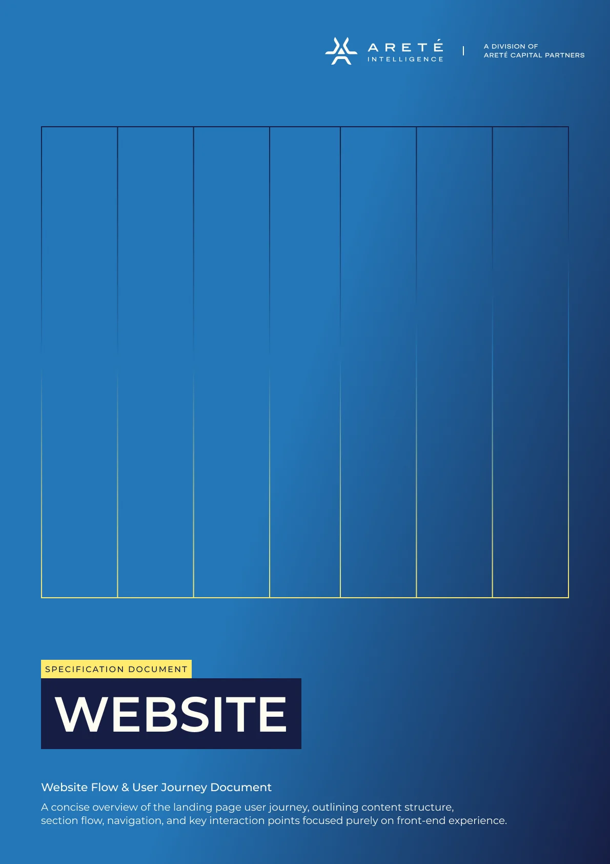
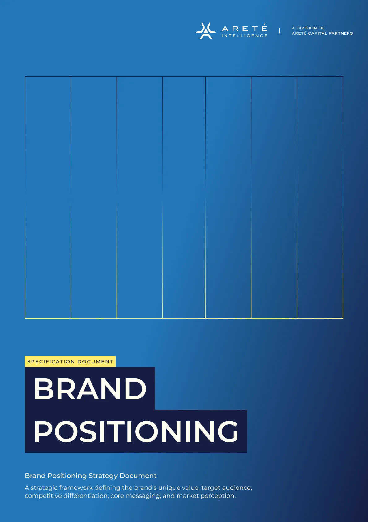
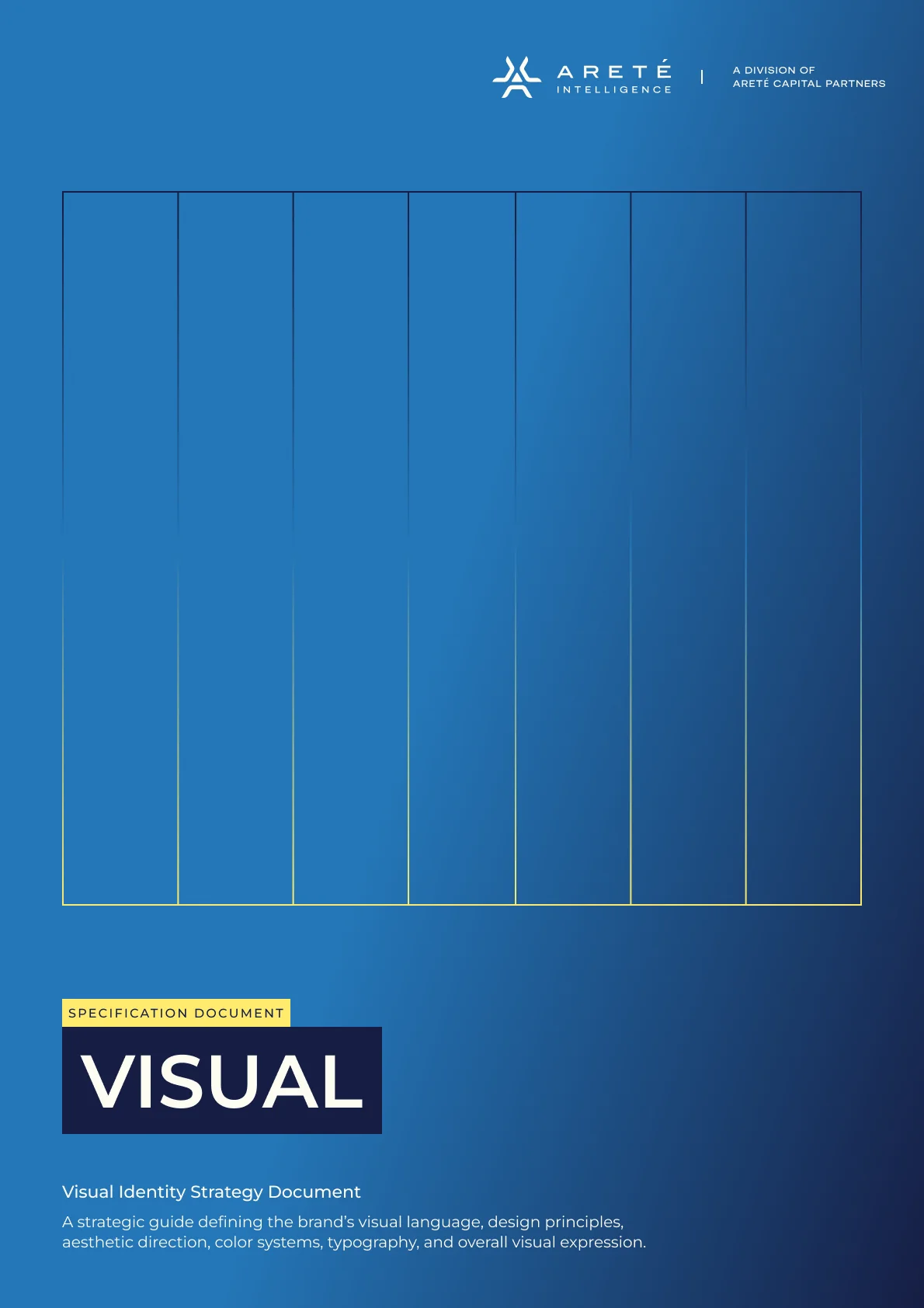
The Website document maps the landing-page user journey: content structure, section flow, navigation and the key interaction points. Brand Positioning defines Areté’s unique value, target audience, competitive differentiation, core messaging and market perception. Visual sets the visual language: design principles, aesthetic direction, colour system, typography and overall visual expression.
Each cover uses the brand itself: a Block headline on the Bluebird gradient, with a fine column grid behind it.
Outcomes
Areté Intelligence launched with one brand from logo to sales deck.
Strategy documents set the positioning, journey and visual direction first. The identity feels as steady as a turnaround partner and as current as an AI company. The website makes a complex offer easy to follow, and the deck and one-pagers give the team a consistent voice with every client.
6
AI logo concepts explored for the division
5
Named brand colours, plus the intelligence gradient
3
Engagement tiers made clear on the website
3
Strategy documents: website, brand positioning and visual
SafeSpace
View case study |