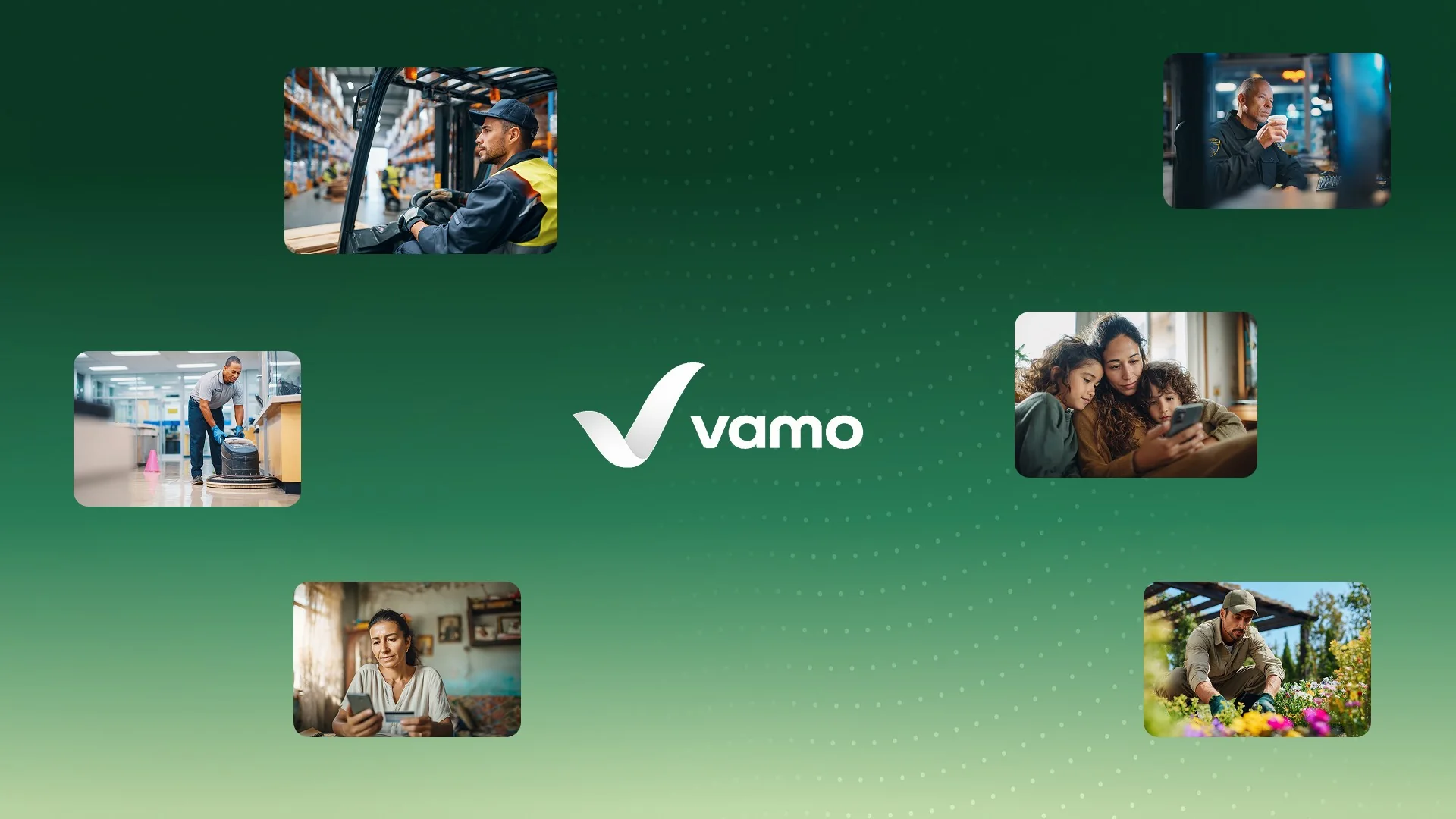
Vamo exists to help workers stop paying to use their own money. Many of the people it serves have spent years losing part of every paycheck to check-cashing fees, money orders and expensive transfers. The brand had to earn their trust quickly, feel warmer than a traditional bank, and look confident without making promises the product could not keep. We built the identity around a single, simple idea: a checkmark. Here is why, and how one mark now does many different jobs.
The brief behind the mark
Financial brands tend to fall into two camps. Some look serious and institutional, which can feel distant to people who have been poorly served by banks. Others look playful and casual, which can undermine trust when people are deciding where their wages should go. Vamo needed to sit between the two: dependable and human at the same time.
The audience also shaped the brief. Vamo is built for workers in industries such as logistics, cleaning, landscaping and security, many of them Latino. The identity had to be understood instantly, without relying on clever wordplay or culturally specific references.
Why a checkmark
A checkmark is one of the most universally understood symbols. It means complete, approved, correct. That is exactly how getting paid directly should feel: no waiting, no fees, no line at a check-cashing counter. The mark expresses the outcome of the product rather than the mechanics of banking.
We drew the checkmark as a folded ribbon in Vamo greens, moving from Bright Green to Dark Green. The fold gives it depth and a sense of motion, so it reads as progress rather than a static tick on a form. Paired with the lowercase “vamo” wordmark, it feels approachable and modern.
The name helps too. “Vamo” carries the energy of “let’s go”, and the forward motion of the checkmark reinforces it without needing any explanation.
The idea stays the same while the expression changes.
Variants for every surface
A logo that only works large is not finished. The Vamo mark comes in several arrangements: the full horizontal logo with the wordmark, a stacked version for square spaces, and the checkmark on its own for app icons, favicons and small placements.
Each variant was tested at the size it will actually appear. The standalone checkmark, for example, has to stay recognisable at the size of an app icon on a crowded home screen. The ribbon fold is simplified at small sizes so it does not turn into visual noise.
We also tested the mark on the brand’s backgrounds: white, Air Green, Vamo Dark Blue and photography. A mark that relies on one perfect background breaks the first time a campaign needs something different.
Colour that carries meaning
Green is an obvious choice for money, which is exactly why it needed care. Vamo’s Bright Green (#95D904) is vivid and optimistic rather than the darker greens used by many banks. It is paired with Vamo Dark Blue (#1E2F59), which brings seriousness and contrast.
In the wider system, green is reserved for action and positive outcomes. Keeping the mark’s colour connected to that meaning means every green button and every checkmark across the product reinforces the same idea.
Room for campaigns
A strong, simple mark gives campaigns something to build on. One example is the checkmark minted on a gold coin. The image shows value kept rather than value spent, which is the heart of the Vamo story.
The coin works because the core idea stays fixed while the expression changes. The checkmark is still the hero; the material and context tell a new part of the story. That balance lets the brand stay recognisable while it adapts to different messages and channels.
How the mark was developed
We explored several directions before settling on the checkmark, including abstract monograms and symbols based on movement and connection. Each was tested against the same questions. Would the audience understand it instantly? Would it work as an app icon? Could it carry the brand’s optimism without feeling childish?
The checkmark answered all three most clearly. From there, the work was about refinement: the angle of the stroke, the depth of the fold, the balance between the mark and the wordmark, and how the gradient behaves at very small sizes.
Guidelines that protect the mark
A mark is only as strong as how consistently it is used. The guidelines define clear space around the logo, minimum sizes for each variant, approved colour combinations, and what not to do, such as stretching the mark, recolouring it outside the palette or placing it on busy backgrounds without contrast.
These rules can feel restrictive, but they are what allow many different people, from internal teams to partners and employers, to use the brand without diluting it.
What we would do again
Start from the promise of the product, not from a visual trend. Choose a symbol your audience already understands. Design for the smallest size first. And document the meaning behind colours and shapes, so that everyone who uses the brand later keeps that meaning intact.
Lessons from the mark
- Choose a symbol that carries the promise of the product.
- Design variants for the smallest sizes, not just the largest.
- Test the mark on every background the brand will use.
- Keep the core idea fixed and let campaigns vary the expression.